

Pinterest is a visual bookmarking and discovery platform. Think of it like a mood board app for the internet.
Problem
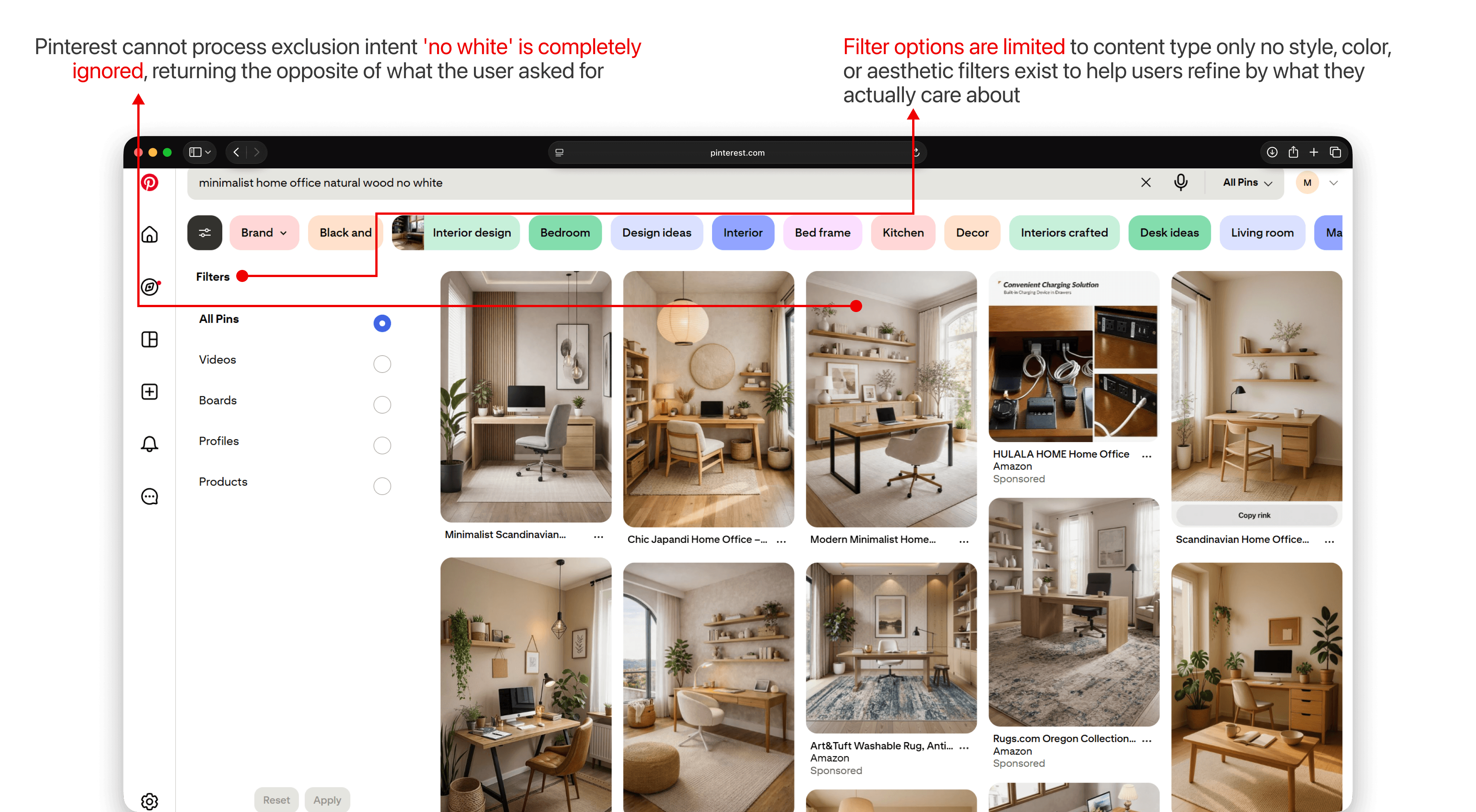
Pinterest is where home decor inspiration starts but rarely where it ends. Users arrive with a feeling, not a keyword. The current search experience is built for precision queries, not the way decorators actually think: by style, mood, and aesthetic. The result is a gap between what users are looking for and what Pinterest surfaces back to them.
What I wanted to find out
Before designing anything, I wanted to understand whether this was actually a widespread frustration or just an edge case. I spent time in r/homeimprovement and r/malelivingspace reading how people talked about Pinterest search unprompted. The pattern was consistent users describing giving up on Pinterest search mid-journey and switching to Google Images instead. They weren't failing to find anything they were failing to find the right thing for their specific aesthetic.
This gave me a clear enough signal to define the problem more precisely: Pinterest search is optimized for object-level discovery, not intent-driven exploration.
Three design questions I used to frame the work
These became the three focus areas for the redesign.
Design decisions - and why
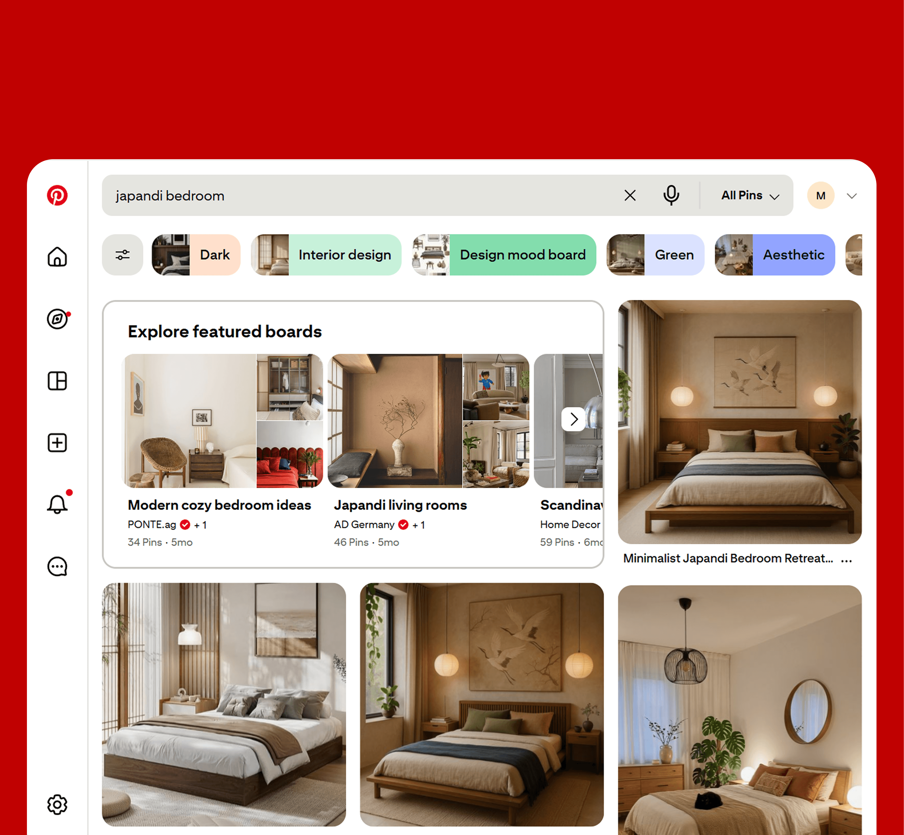
Style-based content grouping over a flat grid The current Pinterest grid treats all results equally. A search for "living room" returns thousands of pins with no way to filter by aesthetic. I introduced style-based groupings (Japandi, Maximalist, Coastal, etc.) as a primary filter layer letting users orient by feel before they scroll. The decision was to make aesthetic the primary navigation axis, not recency or popularity.
Visual search expanded to the full room Pinterest's existing visual search is object-level you can find a similar lamp, but not a similar room. I extended visual search to the main search bar, letting users upload a photo of their own space and surface pins that match the full aesthetic, not a single item. This came directly from a pattern I noticed in Reddit threads users photographing their own rooms and manually describing them in search queries, looking for something the tool couldn't do yet.
Smart recovery from dead-ends When a specific search returns poor results, the redesign surfaces suggestions based on the user's saved boards and style history rather than defaulting to generic popular pins. The idea: use what Pinterest already knows about the user to rescue a failed search rather than abandoning them.
01
Research
User reviews, Reddit threads, and usability sessions revealed users could not find specific styles, room types, or products
home decor searchers didn't find what they were looking for
8 out of 10

02
Design Process
Research and audit of Pinterest's search experience defined three focus areas for the redesign.
Explore methods to allow users to refine searches by style, color palette, and budget on Pinterest, with appropriate filters for each to reduce frustration with drop-offs from irrelevant results.
Lead users to relevant pins when their specific search returns poor results, while surfacing smart suggestions that reflect their saved boards and style history.
Introduce style-based content grouping, filters, a dedicated search results page to match the mental models of intentional home decor searchers.
03
User journeys
User journeys and iterative wireframes leading to final designs
Mapped the end-to-end search journey to identify where intent breaks down and designed solutions that meet user needs at every decision point.
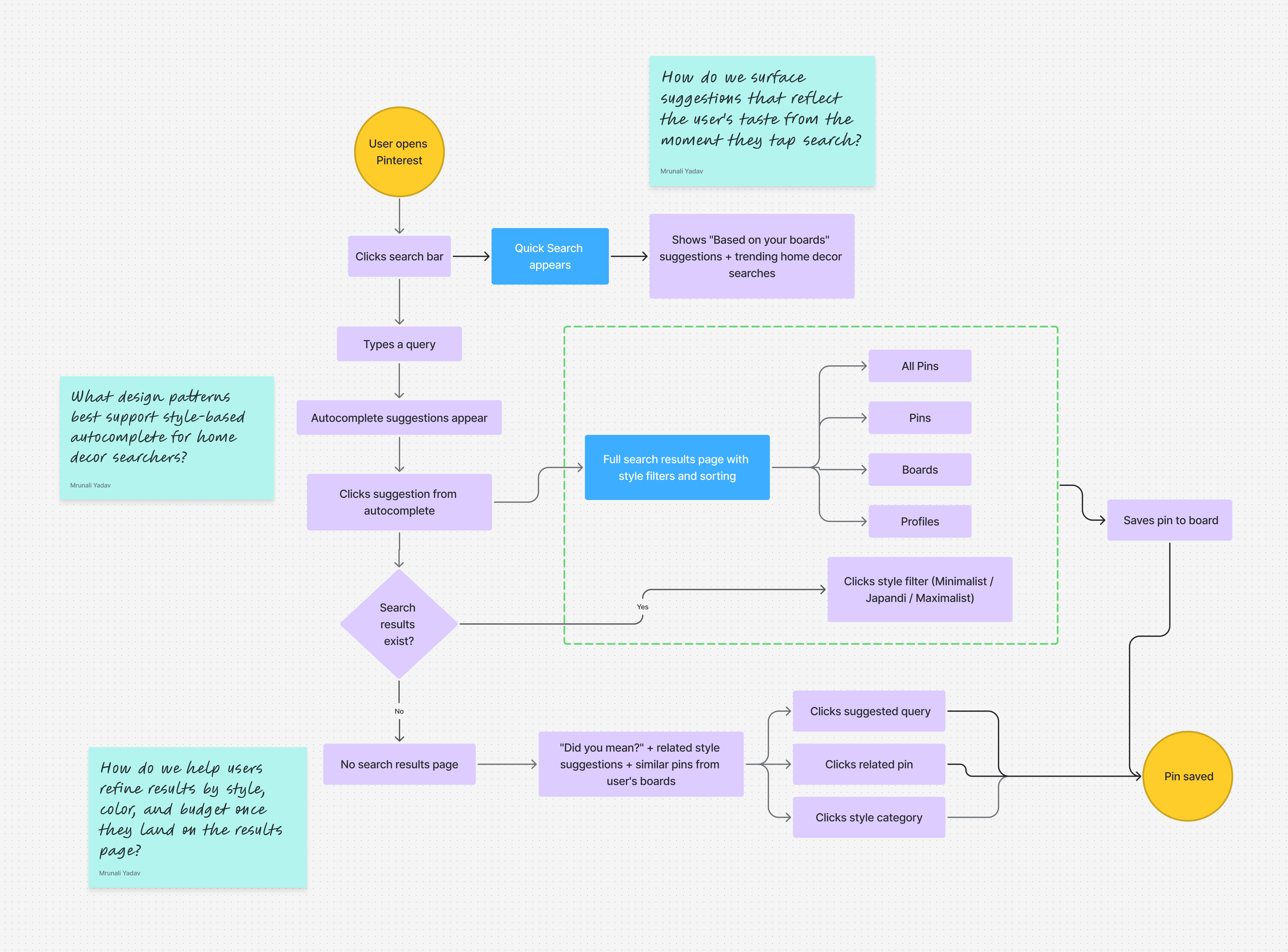
User journey - Pinterest search redesign
04
Final Designs
Style-based content grouping, persistent filters, and expandable categories replace the flat undifferentiated grid

Pinterest search redesign
From object to room, visual search for the whole space
Pinterest's visual search exists but is limited to object-level search within existing pins. The redesign brings visual search to the main web search bar, letting users upload a photo of their own space and find pins that match their full room aesthetic not just a single item.

05
Usability Testing
I tested the redesign with 6 participants matching the target profile millennials aged 25–35 actively working on home projects. The sessions were task-based: find a living room aesthetic matching a reference image, filter by budget, recover from a dead-end search.
What came through clearly:
Remaining friction: participants wanted style recommendations to get more personalized over time, which points to a longer-term personalization layer beyond the scope of this redesign.
Feedback from user testing (Millennial home decor searchers aged 25–35)
06
Rather than projecting false precision, here's what I'd track to validate the design decisions:
07
What I learned
The hardest part of this project wasn't the design it was resisting the urge to solve everything. Pinterest search has a dozen problems. I had to keep coming back to the one insight that actually held up across research: users search by feeling, not by keyword. Every design decision I made had to connect back to that. The ones that didn't got cut.
Speculative work also taught me to be more rigorous about separating what I observed from what I assumed. The Reddit research gave me real signal. The usability testing gave me real reactions. Everything else was a hypothesis and I tried to be honest with myself about which was which.
08
Results
Usability testing showed users found style-matched content faster and gave up less pointing to a search experience that finally matches how decorators think.
*Findings from moderated usability testing with 6 participants. This is a speculative redesign.