Zyllyon - Professional Networking Reimagined

Built a 0-to-1 mobile networking app that replaced traditional business cards with digital profiles, designed for spontaneous in-person connections at events, conferences, and meetups. Led end-to-end design from concept to launched product with 15K+ downloads.

Role

Product Designer, UIUX Designer

Team

2 Product Designers

Sector

B2C Networking

Duration

July 2025 - January 2026

Challenge

Traditional networking tools business cards and LinkedIn weren't designed for spontaneous, in-person connections. Business cards get lost or forgotten, while LinkedIn requires WiFi, app switching, and awkward "what's your last name?" moments. Young professionals attending events, conferences, and meetups needed a frictionless way to exchange professional information instantly, without disrupting the flow of conversation.

Design Process

As a two-person team building this app from scratch, I wore multiple hats — leading user research, defining the product vision, designing the entire user experience, and collaborating closely with our developer to ship a functional MVP. I used a lean design thinking approach: conducting user interviews to validate the problem, rapidly prototyping solutions, testing with real users at networking events, and iterating based on feedback to create an intuitive, visually distinctive networking experience.

01

Understanding The Problem
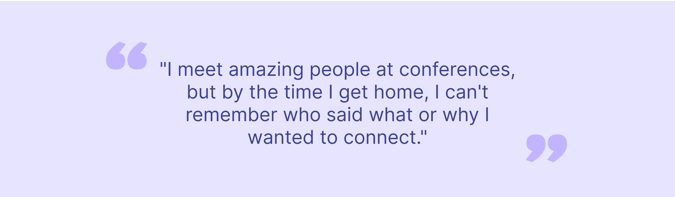
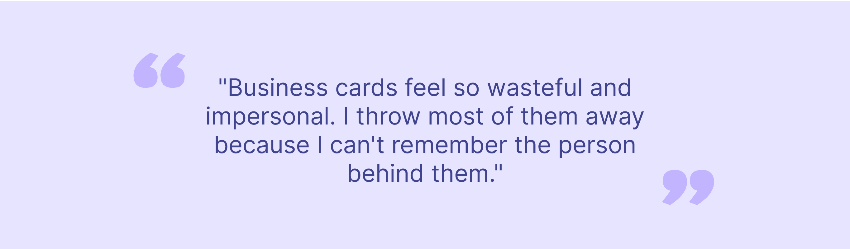
Research helps you empathize with users and experience the product as they do. To validate whether this was a real problem worth solving, I conducted user interviews and observational research at networking events.

02

Conducting User Interviews

I interviewed 40+ young professionals (ages 22-35) who regularly attended networking events, conferences, and meetups. My goal was to understand:

- How do people currently exchange professional information?

- What frustrates them about existing tools (business cards, LinkedIn)?

- When do they feel most awkward or inefficient during networking?

- What would make in-person networking feel effortless?

03

Observational Research

I attended 5+ networking events and observed how people exchanged contact information. I noticed: - 60% of people didn't carry business cards - LinkedIn exchanges took 30-60 seconds and broke conversation flow - People often misspelled names, leading to failed connection requests - Groups of 3+ people found it awkward to exchange info simultaneously - No one followed up because they couldn't remember context of the conversat

04

Creating Empathy Maps

While conducting interviews, I started to understand what are the users’ painpoints, I created empathy maps to synthesize what users say, think, feel, and do during networking moments. Common themes emerged: Says: "I'll connect with you on LinkedIn" (but often forgets) Thinks: "I hope I don't lose this business card" Feels: Anxious about awkward LinkedIn search, frustrated by broken flow Does: Pulls out phone, searches name, sends request, returns to conversation

05

User Personas

Alex and Marcus shared similar networking challenges, so I merged their empathy maps to create "Frequent Networker Alex" someone who attends multiple events monthly and needs instant contact exchange with automatic context-saving for follow-up. Sarah and Jessica both valued quality over quantity in networking, so I created "Selective Connector Sarah" someone who wants meaningful connections and needs tools that preserve conversation context for authentic follow-up.

06

Defining the Solution

In the define phase, I synthesized research insights to frame the problem clearly and outline what success would look like.

Problem Statement

Alex is a young professional who attends frequent networking events and needs a frictionless way to exchange professional information in person because he wants to build meaningful connections without awkward LinkedIn searches or lost business cards interrupting the flow of conversation.

Hypothesis Statement

If we create a mobile app that allows instant profile sharing via QR code or NFC tap, then users can exchange professional information in under 5 seconds without breaking conversation flow, and they'll actually follow up because context is saved automatically.

Value Proposition - What Makes Zyllyon Different?

I mapped out core features and categorized them by value: Speed: Exchange info in under

5 seconds (vs. 30-60 sec for LinkedIn) Context: Attach notes about where you met and what you discussed Frictionless: No WiFi required, no name spelling, no app switching Visual: Beautiful digital profiles that stand out (unlike boring business cards) Smart Follow-up: Reminders to reconnect based on when/where you met

07

IDEATION

Exploring Solutions

With a clear problem defined, I started ideating on interaction patterns, visual design, and core user flows.

Competitor Analysis

I evaluated 6 networking apps and digital business card tools. Most fell into two categories: 1. Digital business card replacements (static, boring, felt like PDFs) 2. LinkedIn clones (heavy social features, overwhelming for quick exchanges) Gap identified: No app optimized for spontaneous, in-person exchanges with context-saving and visual appeal.

How Might We Exercise

- HMW make exchanging info faster than pulling out a business card?

- HMW help users remember who they met and why it mattered?

- HMW make networking feel less transactional and more human?

- HMW eliminate the awkwardness of LinkedIn searches?

- HMW make digital profiles feel as personal as a handshake?

Core Functionalities

Based on research and ideation, I defined must-have features:


  1. Instant Profile Sharing: QR code or NFC tap to exchange info in <5 seconds

  2. Context Notes: Add where you met, what you discussed, follow-up reminders

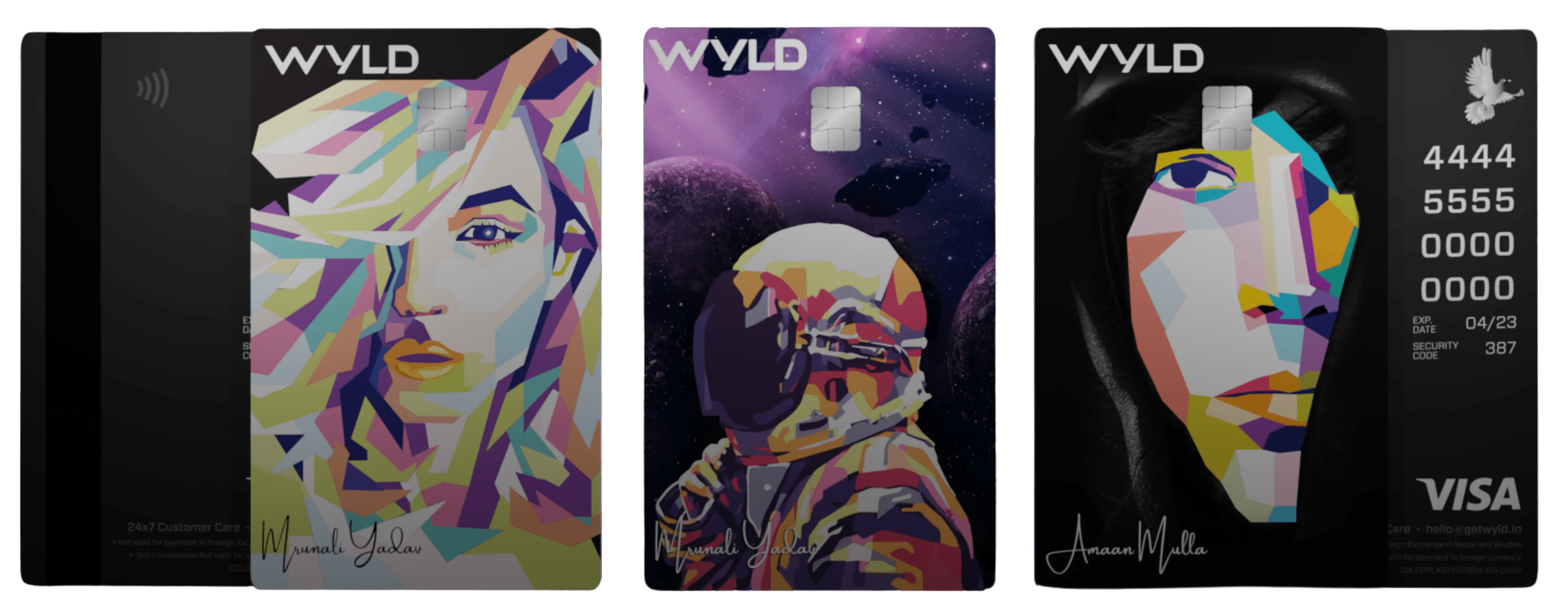
  3. Beautiful Profiles: Visual card-style profiles (not boring lists)

  4. Offline Mode: Works without WiFi (crucial for crowded events)

  5. Smart Follow-up: Reminders to reconnect based on time since meeting

07

DESIGN ITERATION

Bringing Ideas to Life

I started with rough sketches to explore interaction patterns, then moved to wireframes and prototypes.

User Flow

Mapping the Core Journey

I outlined the typical flow for exchanging info at an event:

  1. User opens app → sees their profile card

  2. Generates QR code OR enables NFC tap

  3. Other person scans/taps

  4. Profile appears → user can add context note

  5. Connection saved to "Network" tab

  6. Follow-up reminder sent 3 days late

Sketches and Wireframes


Rapid Prototyping on Paper


I sketched 4-5 variations for key screens:

  • Home screen (profile card display)

  • QR code sharing screen

  • Connection received confirmation

  • Network tab (saved connections)

  • Profile editing


Then I digitized the strongest concepts in Figma.

Key Design Decision: Card Stacking Interaction


The Signature Interaction

Inspired by Apple Wallet, I designed a card-stacking interface where each connection appears as a layered card. Users can swipe through connections like flipping through a deck. This made the app feel tactile and visually distinctive not just another list-based contact manager.


Why it worked:

  • Visual hierarchy: Recent connections on top

  • Familiar mental model: Like physical business cards in a wallet

  • Delightful interaction: Swiping felt satisfying and intuitive

08

USABILITY TESTING

Testing with Real Users


I conducted guerrilla usability testing at 3 networking events with 15+ participants to validate core flows and interaction patterns.

Testing Goals


Can users exchange info in under 10 seconds?


  • Is the QR code scanning flow intuitive?

  • Do users understand the card-stacking interaction?

  • Are context notes being used? If not, why?

  • What's confusing or frustrating?

Key Insights from Testing


Insight 1: QR Code Placement Was Confusing


Users expected the QR code to be immediately visible on the home screen, not buried in a menu.


Fix: Made QR code generation a primary CTA on the home screen.


---


Insight 2: Context Notes Were Skipped


Users wanted to add notes but forgot by the time they opened the app later.


Fix: Added a prompt immediately after receiving a connection: "Add a quick note about [Name]?"


---


Insight 3: Card Stacking Needed Onboarding


First-time users didn't realize they could swipe through cards.


Fix: Added a subtle animation on first launch showing the swipe gesture.


---


Insight 4: Offline Mode Wasn't Clear


Users didn't know the app worked offline, which is critical at crowded events with bad WiFi.


Fix: Added a "No WiFi needed" badge on the home screen.

09

THE PROTOTYPE

Here's the latest high-fidelity prototype with all design iterations implemented. This interactive prototype demonstrates the complete user flow — from opening the app to exchanging contacts via QR code to adding context notes and browsing saved connections. Interact with the prototype and share your feedback!

09

THE IMPLEMENTATION

I am currently building Zyllyon using Cursor and Claude Code to translate the design into a functional app. This hands-on implementation phase allows me to test real-world usability, validate technical feasibility, and iterate based on constraints I encounter during development.


Below is a small glimpse of the app in progress!

No headings found on page

Stay Updated with me

Links

Social

© 2026 Mrunali Yadav Portfolio. All rights reserved.

Stay Updated with me

Links

Social

© 2026 Mrunali Yadav Portfolio. All rights reserved.

Stay Updated with me

Links

Social

© 2026 Mrunali Yadav Portfolio. All rights reserved.