


Overview
Axo is a premium preventive-health membership platform, biomarker testing, personalized protocols, and wearable integrations, operating across Spain, the UK, Ireland, the Netherlands, Germany, and Peru.
As Product Designer, I own the full pipeline from Figma to shipped product: designing flows, building the design system, and implementing pages directly in code, closing the gap that usually exists between a design file and what actually ships.
The Problem
One flow, six countries, zero shared system.
Understanding the System
Before redesigning anything, I had to understand what already existed - and why.
I audited every country variant of the booking and add-ons flow against Wendy’s canonical flow map, cross-referenced actual design specs from the live Webflow inspector rather than assuming values, and sat down with engineering (Josue, Piero, Shamim) to understand exactly where backend constraints, lab lead times, address validation, add-on eligibility, actually lived in the flow.
What I found:
01
Auditing the Existing Flow
I looked at the four most commonly used finance apps Mint, YNAB, Copilot, and Monarch through one specific lens: Do they acknowledge how you feel?
| PULSE | MINT | YNAB | COPILOT | MONARCH | |
|---|---|---|---|---|---|
| Core Tracking | |||||
| Tracks income & expenses | ✓ | ✓ | ✓ | ✓ | ✓ |
| Categorizes transactions automatically | ✓ | ✓ | ✓ | ✓ | ✓ |
| Budget goal setting | ✗ | ✓ | ✓ | ✓ | ✓ |
| Emotional Intelligence | |||||
| Mood / emotion tracking | ✓ | ✗ | ✗ | ✗ | ✗ |
| Connects spending to emotional state | ✓ | ✗ | ✗ | ✗ | ✗ |
| Judgment-free language & tone | ✓ | ✗ | ✗ | ~ | ~ |
| AI & Insights | |||||
| AI-powered behavioral insights | ✓ | ✗ | ✗ | ~ | ~ |
| Conversational AI coach | ✓ | ✗ | ✗ | ✗ | ✗ |
| Pattern recognition over time | ✓ | ~ | ~ | ✓ | ✓ |
None of them do. They all assume that if you can see your spending clearly enough, you’ll change it. But that’s not how behavior change works. Insight alone isn’t enough especially when the insight makes you feel worse.
02
The Opportunity
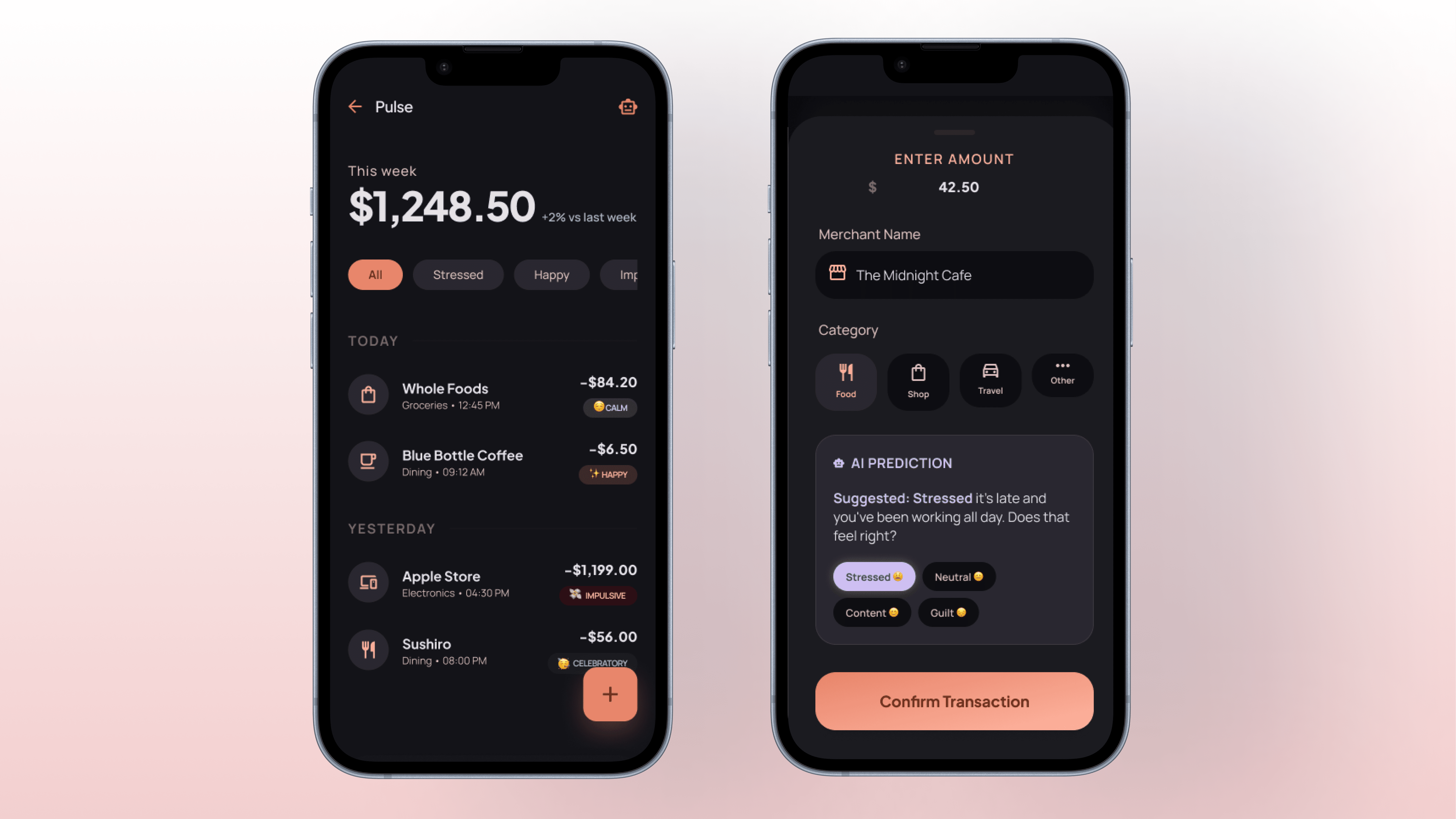
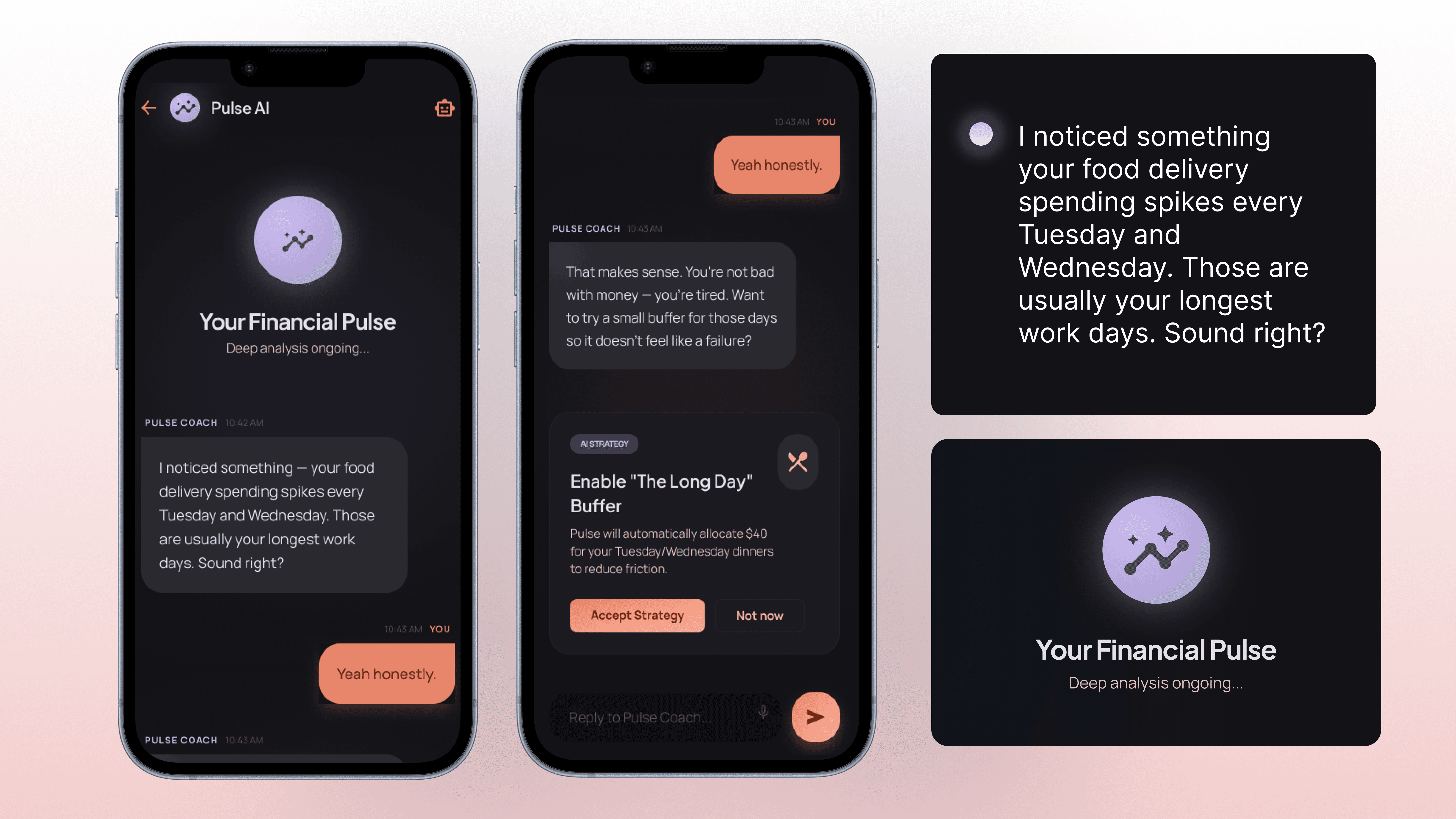
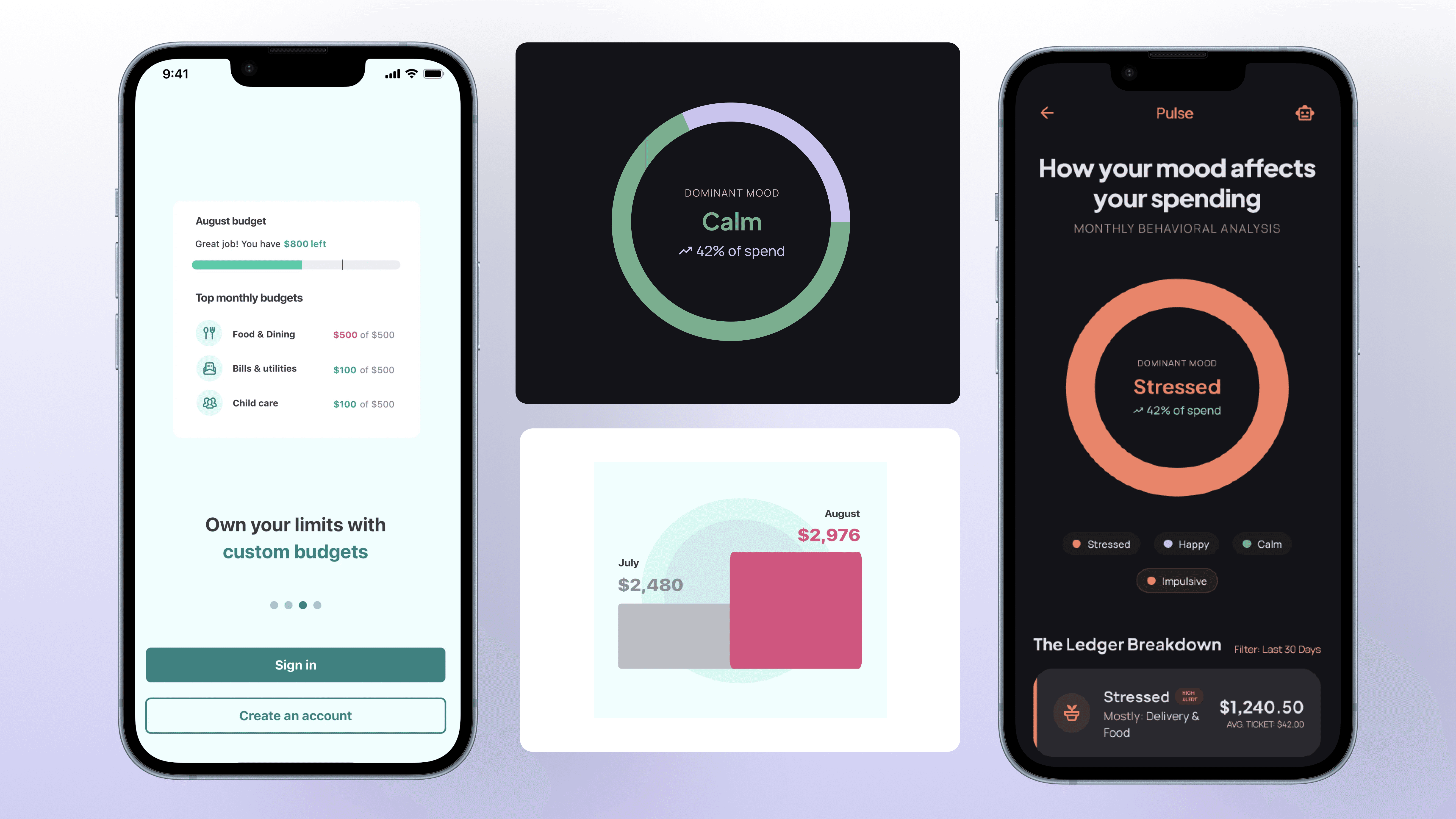
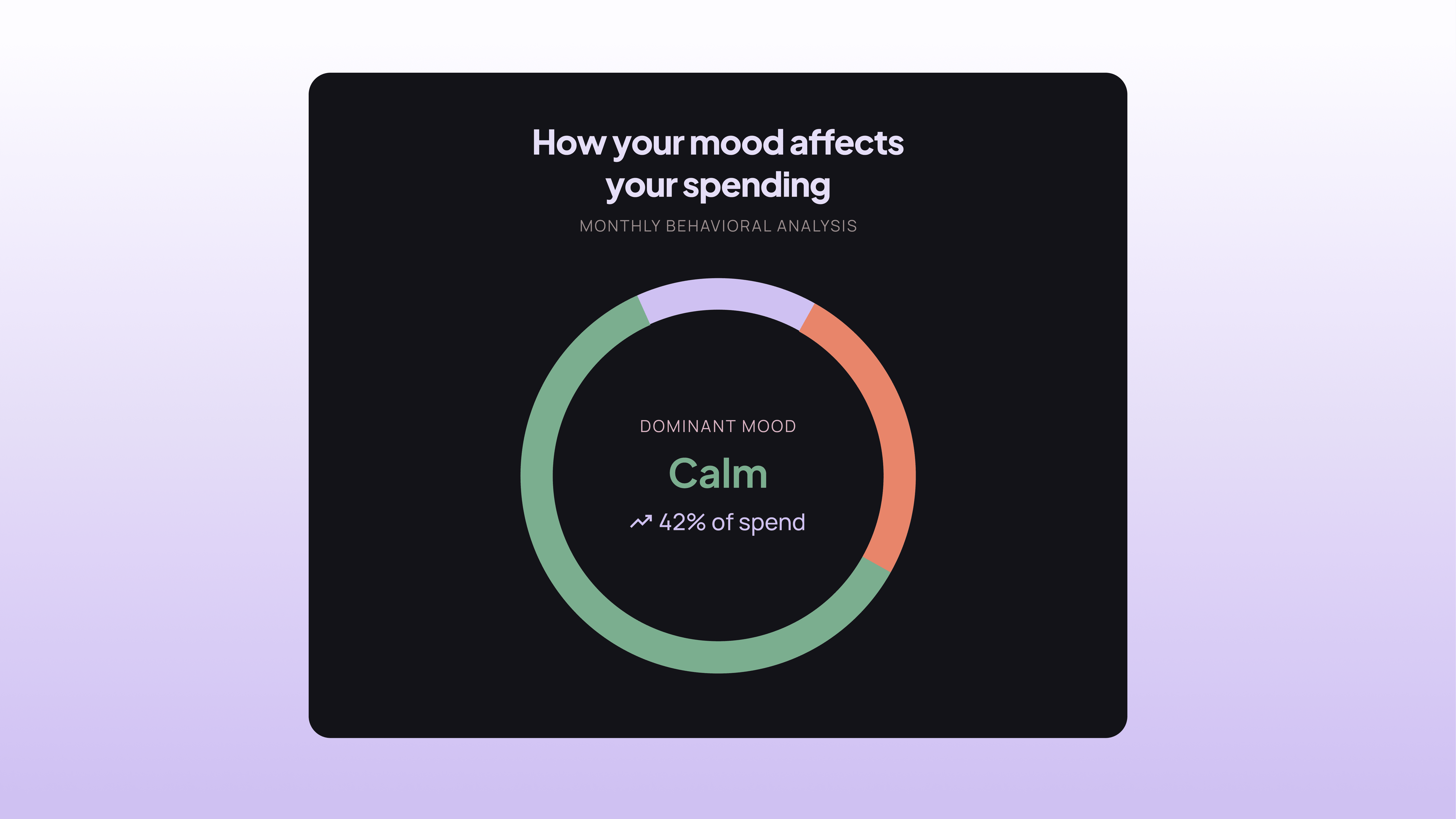
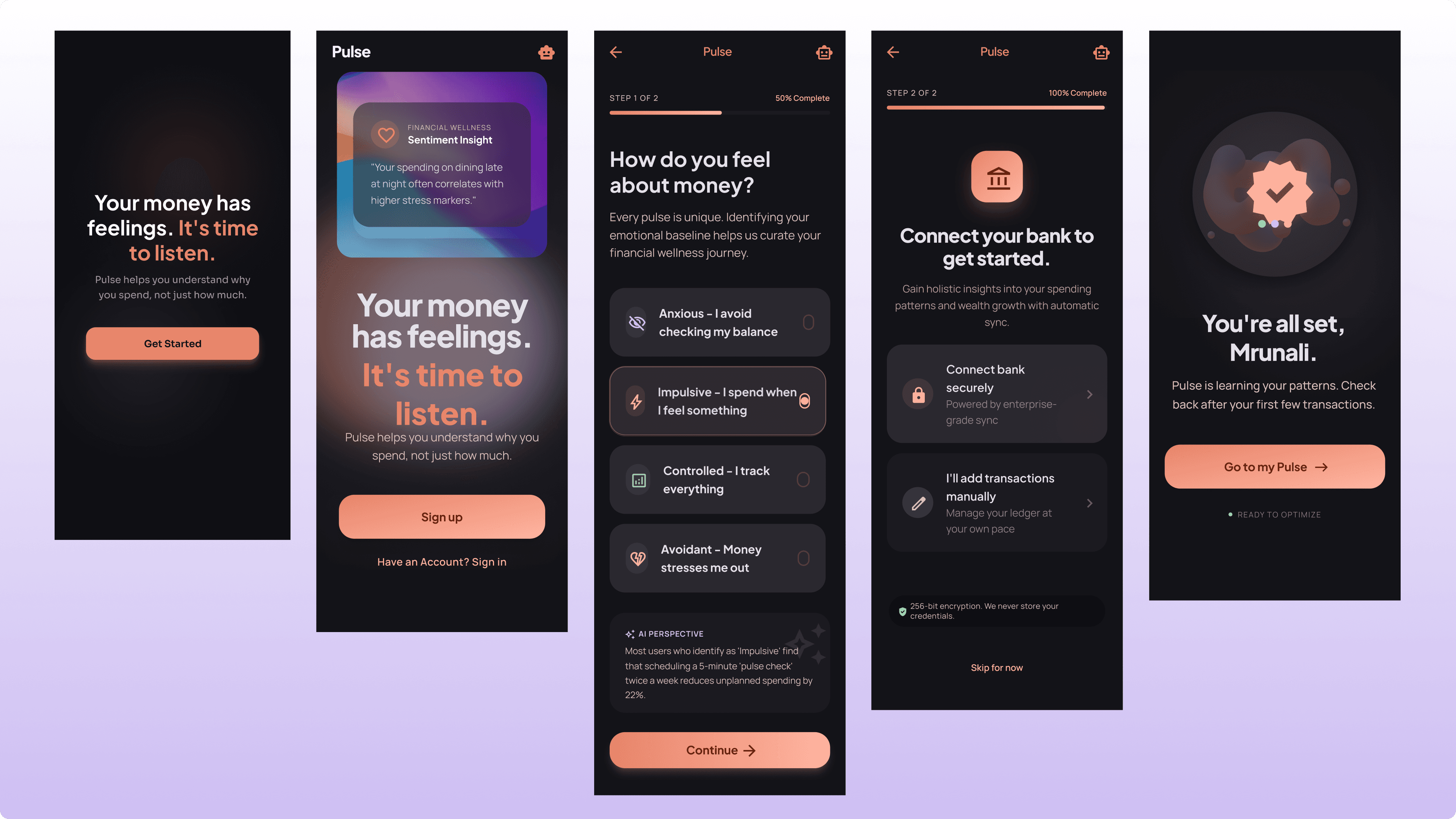
The gap I was designing toward: an app that doesn’t just log your transactions, but connects them to your emotional state and over time, helps you see the patterns you couldn’t see before.
Not to shame you. To help you understand yourself.
03
Design Principles
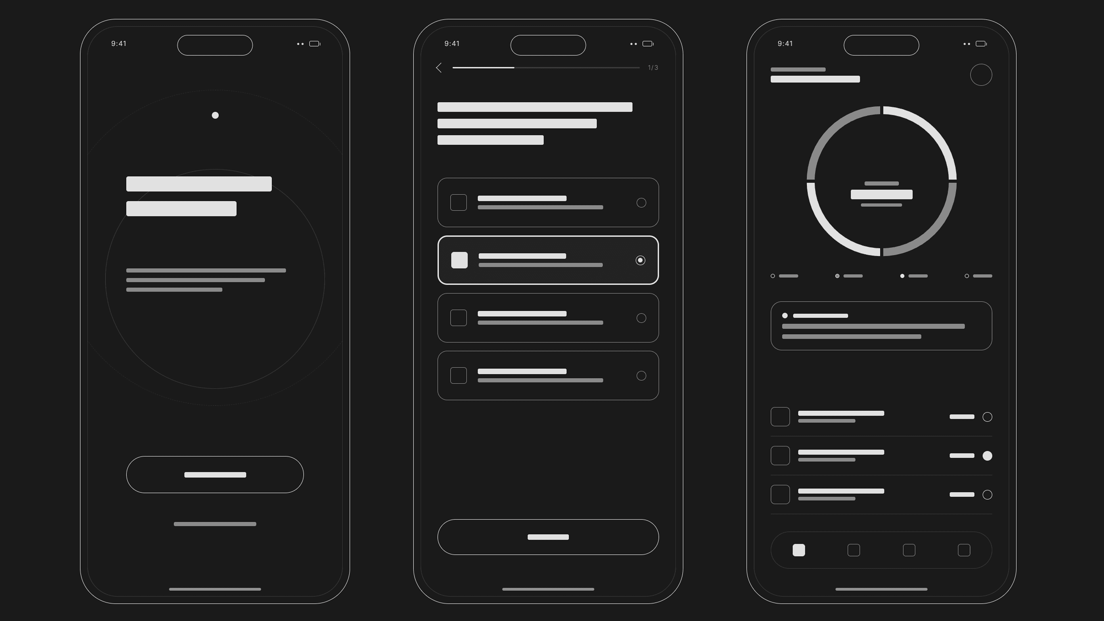
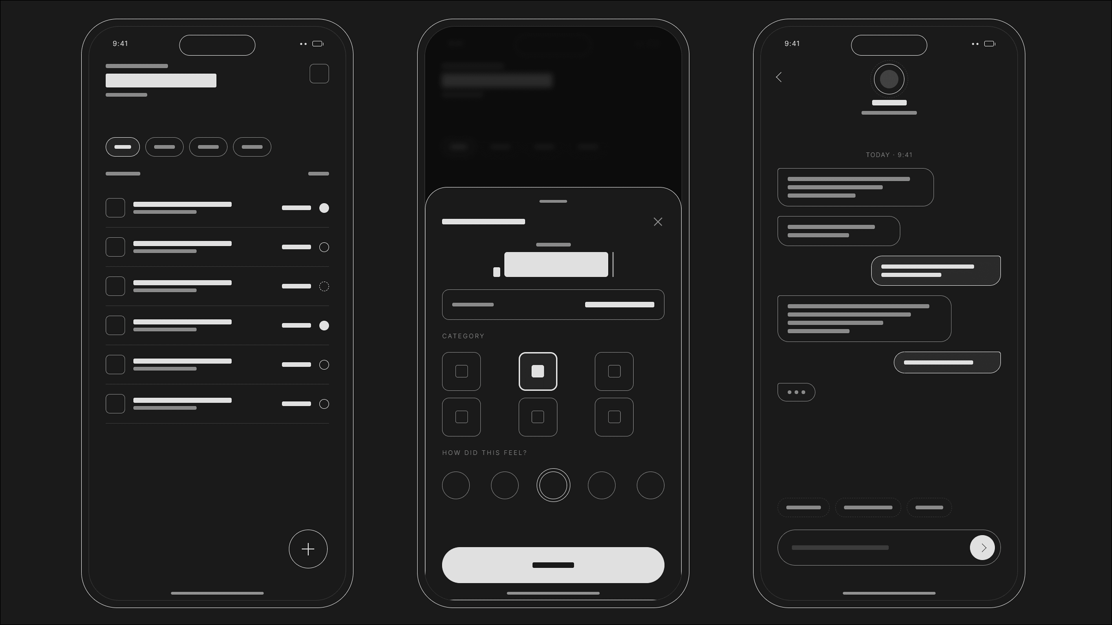
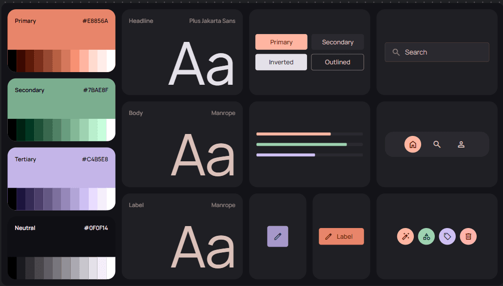
Systems over screens. Every component had to be a reusable symbol, not a one-off frame. Duplicate, don't redesign.
Mobile-first, always. ~90% of Axo's users are on mobile. Desktop only gets touched when something actually changes.
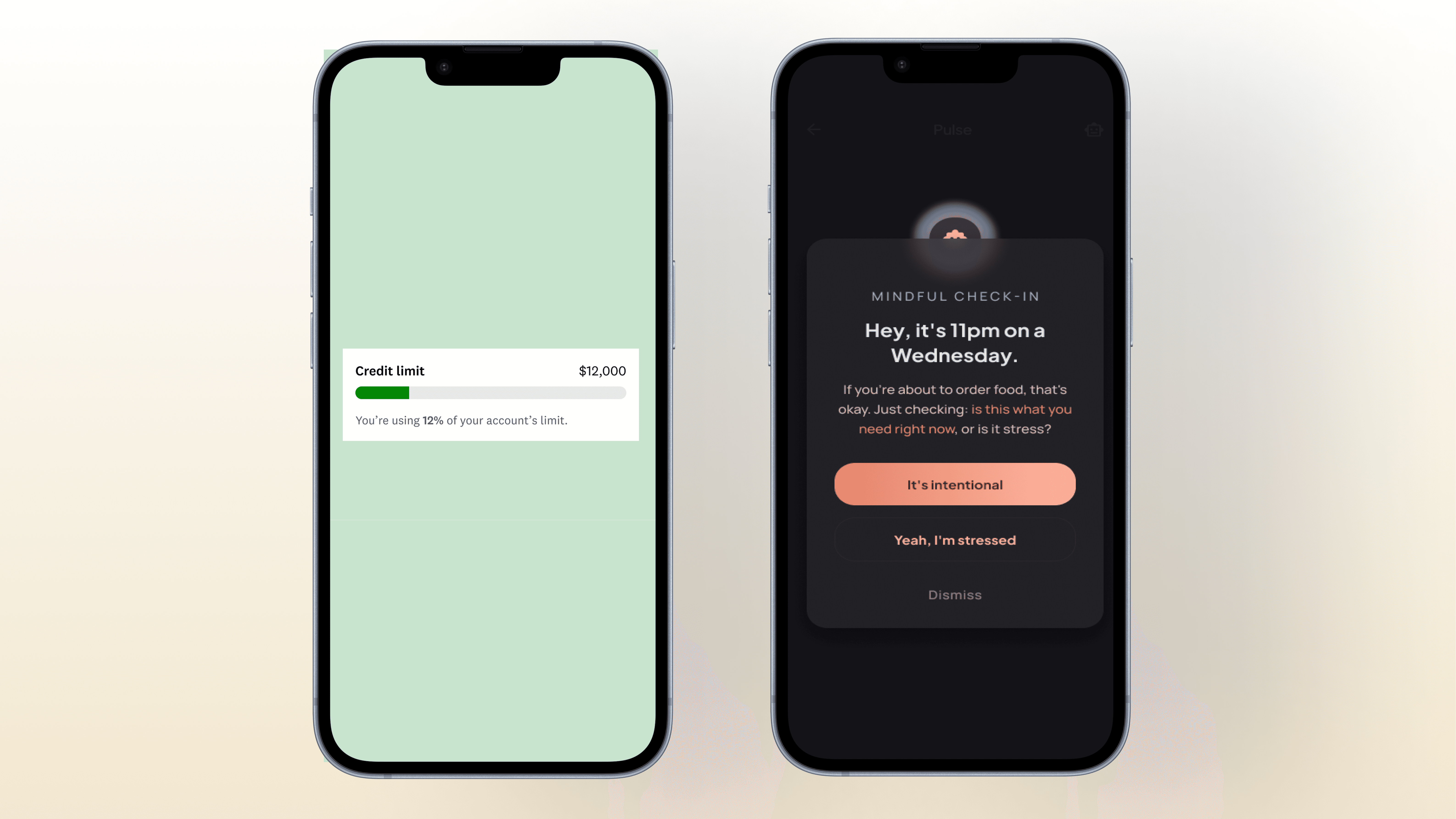
Premium, never salesy. Popups, modals, and nudges had to feel calm and considered — the opposite of a growth-hacked upsell.
The app never tells you you're doing badly. It reflects patterns back without judgment to any users thoughout the journey
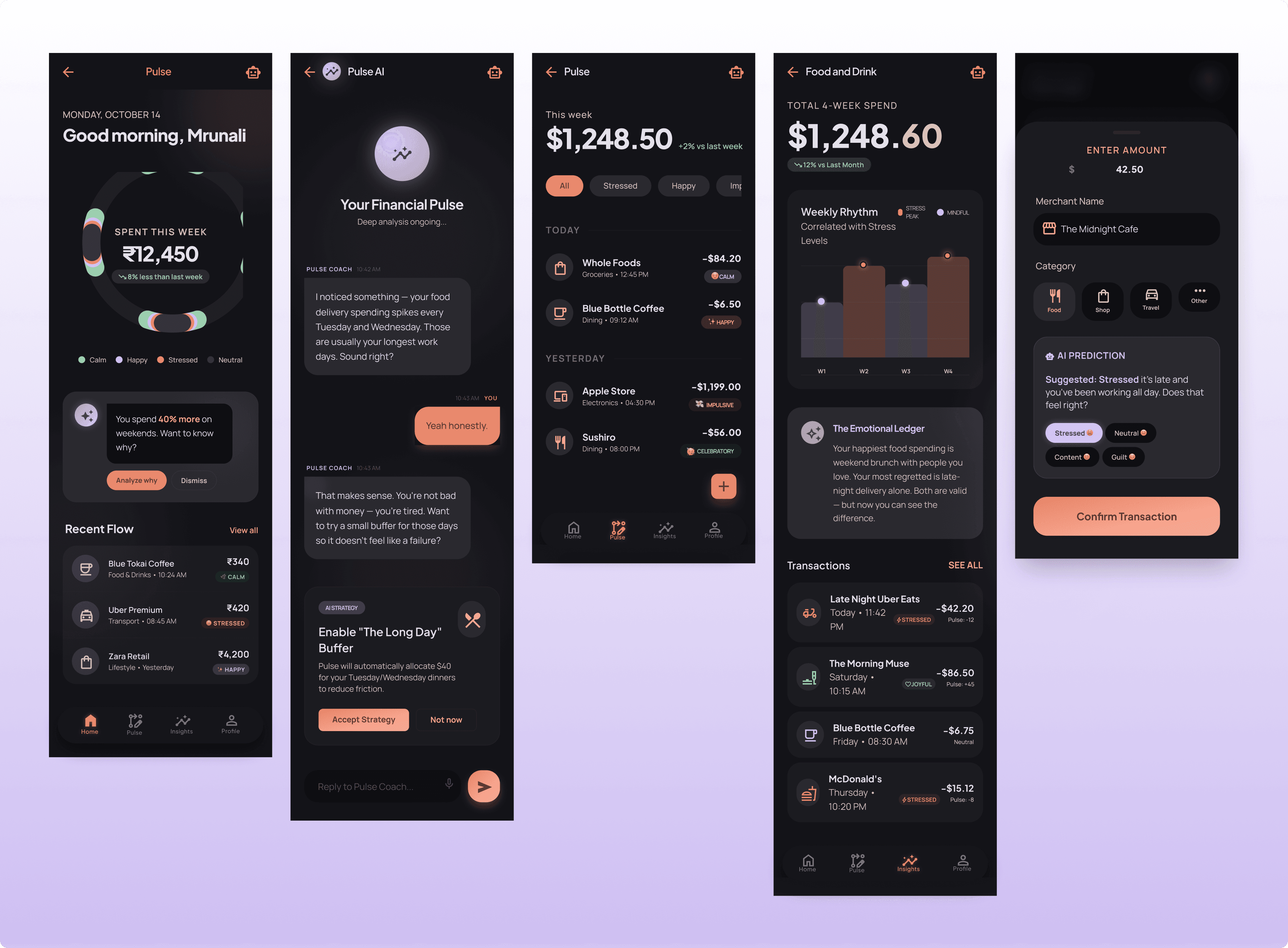
Adding a mood tag to a transaction should take 2 seconds. But the insight that comes from 3 weeks of those tags should feel meaningful.
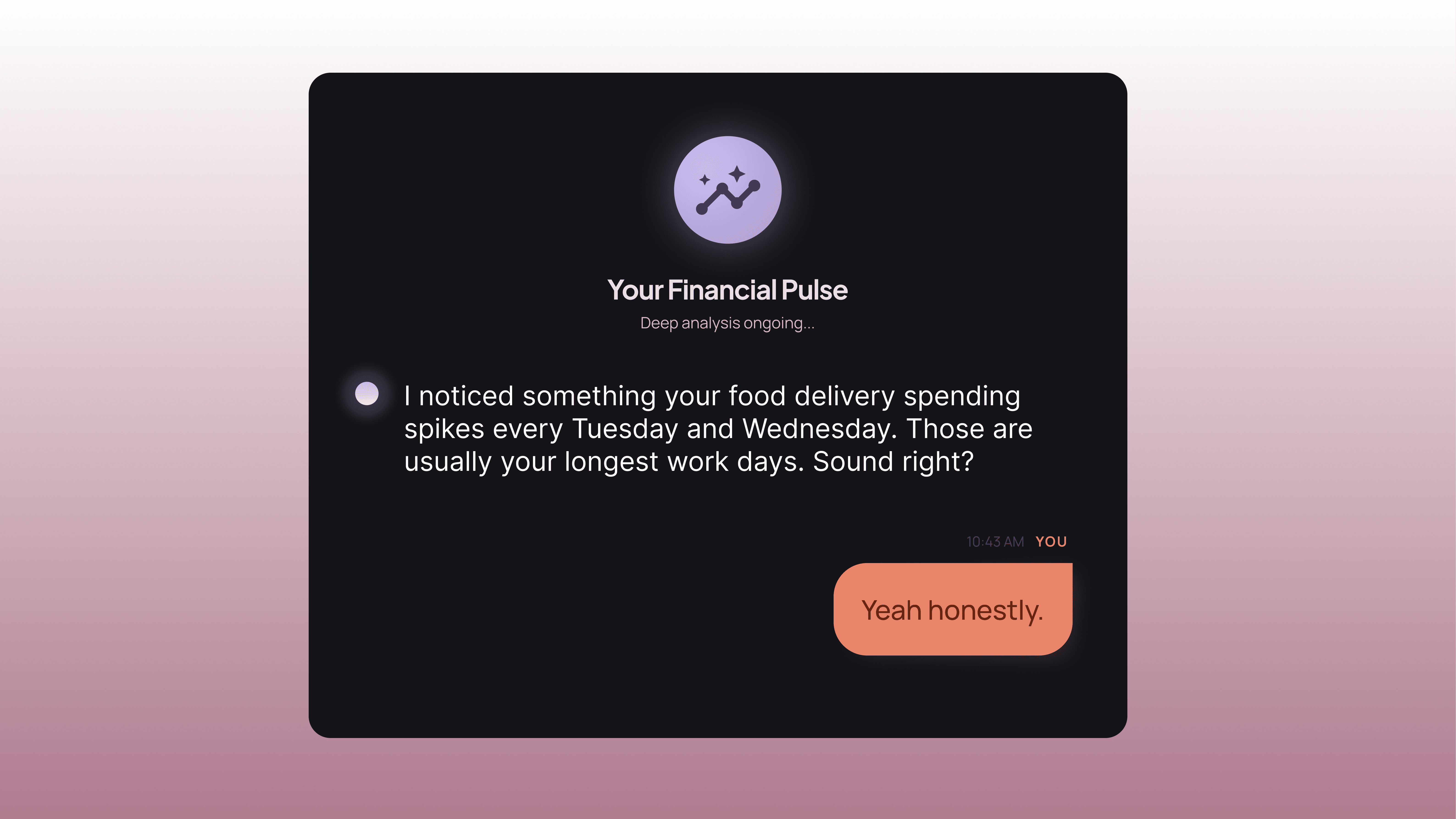
not a calculator. The AI in Pulse doesn't just surface data it notices things, asks questions, and talks to you like a person who's been paying attention.
04
Solution
Axo Longevity one system, six markets, no more one-offs.
05
Design Decisions
With Axo migrating off Webflow, the instinct is to just rebuild each page as-is. Instead, we built shared modules first header, footer, hero, protocol steps, pricing cards — so every new page assembles from parts that already exist, instead of being designed from zero. A pricing card built once works on every page it appears on.
An earlier direction used abstract colored dots to represent test-kit contents. It looked clean in Figma and meant nothing to a customer standing in front of a box of actual test tubes. We rebuilt it around real tube photography — grouped by kit, captioned by cap color — because the moment that mattered was someone holding the physical kit, not looking at a diagram.
The Netherlands flow asked for a delivery address before the customer had even chosen a lab — which meant address errors were surfacing before the system even knew what needed shipping. Moving address collection to its own later step, with an inline example format, cut the ambiguity that was generating support tickets.
06
07
Reflection
What I’d do differently with more time:
This is a live product, not a concept.
Everything shown here is either shipped or in active review with the team. That changes the job: I'm not designing for an imagined user, I'm designing against real support tickets, real engineering constraints, and a lead designer who reviews every change before it goes live.
What this project has taught me:
Good design at this stage isn't about the cleverest screen — it's about building systems that other people can extend without you in the room. The best fix I shipped wasn't a new interaction pattern, it was reordering two existing steps because I understood why the flow was breaking, not just that it was.
